
TipTalk - iOS Design
TipTalk is a messaging platform that gives direct one-on-one access to verified professionals, experts and stars in various categories and interests. For a small price set by the TipTalkers, users can request text, video, or photo responses.

Opportunity
My goal was to bring some organization and clarity to the app through hierarchy and giving more emphasis to white space. Although there are new features being designed, developed, and tested behind the scenes, as well as many iterations that won't be touched on here, I wanted to give an overview of some key milestones for the app that are public as of November 2016.
My Role
I came on as the sole designer to work within and help refine the existing design patterns on the iOS app, as well as to design UI/UX solutions from ideation to high-fidelity assets. This eventually turned into a much larger role in redesigning the app's brand, and working on the iOS app, web app, and some key marketing. Since last November, I've refined the app to be ready for launch, continuously iterated on the design since launch based off of user testing and future goals for where the team saw the app heading, redesigned the brand aesthetic to reflect the demographic of our users, designed the web app for desktop and mobile users, and designed our promotional marketing site. I've also had my hand in several other marketing ads and email campaigns, but most of my focus has been on constantly improving the user interface and experience on our products.

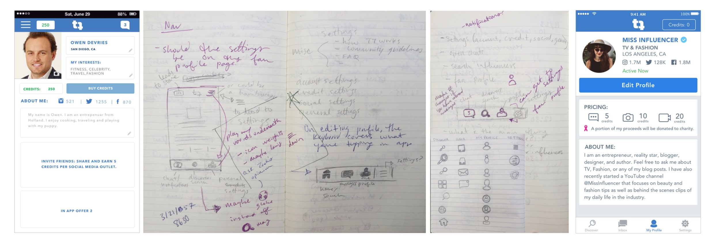
Original designs that were handed off to me when I first joined the company. There were many points that needed to be updated based off our internal testing, plus things that stuck out to me that really needed organization and simplicity.
Process
Cleaning up the navigation bar
One of the first issues that stuck out was the cluttered navigation bar. The original design had a hamburger menu that tucked away all other screens, the credit amount you had to spend (and acted as a link to the store), your inbox, and the logo. Ultimately, it was doing too many things at once and didn't follow standard UX patterns that users would expect from other apps.
The CTO and I discussed this and ultimately decided to split the navigation bar into a top nav which would handle history and search, and a bottom tab bar which would allow users to quickly switch between the most important screens of the app. This pattern was well established by other apps, meaning users would intuitively understand how to use it.
Re-focusing Discover
We received feedback from users saying it was difficult to navigate in the horizontal sliders, and to know who all was on the app because every user was not featured on the Discover page. There was no way to search by category, so the only way to browse was to view a select few curated TipTalkers on the main screen. TipTalkers not featured were only found through searching their name, and thus had no discoverability.

The two main goals we had with improving Discover was to create category sections so all users could be discovered, and to keep the idea of a ‘featured’ page where we could promote specific influencers in categories, as well as any new teams or promotions in the banner section.

I sketched through several options for how we could display categories and update the label containers for users to better fit their names (there were a lot of ellipses). We thought a slider would work well, it starts the user off on the featured screen but gives just as much importance to the category screens. It took several versions to get to a solution we thought was strong, and a lot of testing with code, but we finally landed on something we felt was approachable, easy to navigate, and showed all important information for users. We also had a huge design update with new text treatment, a new color palette, and overall tone to the app. Below are a few iterations led to the final design, which you can see in the prototype gif at the end.


The final design has a small bounce as a delighter for users, and responsive text labels so no information is cut off.
Improving the chat experience
The main issue with the message composer was that users didn't know they could request different types of responses until they had already typed out their question, nor did they know the cost of their request on the screen. It made sense that each option should be shown immediately in one place on the screen, so that a user could easily see the prices and options, and could quickly tap what type of message responses they wanted.

The solution was to create buttons to toggle between, and the price would adjust in a dialog above.

Creating a flexible profile
Since we launched in the spring we’ve learned a lot about what users want, how they use the product, and what does and doesn't work for them. I was able to notice key issues in the first build. Users didn’t always fill out profiles, and had no way to know what their own profile looked like to other users. So if they didn't complete their profile, they didn't know how much of a disadvantage they could be at for other users learning about them. Many Influencers also liked to include incredibly long bios, which we did not expect but needed to adapt for. This meant a different solution was needed for displaying the profile information and for editing a profile.

The original design
The main goal of the profile redesign was to create a space with hierarchy. The most important part of viewing a user's profile was the "Start Messaging" button. If that wasn't clear, users would give up when trying to send a message, meaning everyone lost. The second most important part was pricing. The pricing in the original designs didn't stick out at all. There was a problem with too much color and text going on, and nothing having the space it needed to breathe.


Some early on variations that ultimately didn't solve the problem.
With these goals in mind, and several moments of research, sketching, mocking up and testing, we now had a much better layout for the profile. The CTA was prominent and focal, and all other information was organized to a sectioned container. The amount of color had been reduced everywhere to give focus on the name and button, and each section had enough space that it was clear to navigate.


Updated design with more organization and separation between preview and edit screens.
Highlights
These are by no means the only features and improvements that have been made on the iOS app, but they are important milestones for the app itself. To summarize:
The Discover view now priorities ease of search between categories
User profiles preview exactly what the profile will look like to other users and contain a simplified and organized editing system
Influencer profile layout has been reorganized to achieve the main goal to “Start Messaging”
Chat Experience has an added icon system for clarity in requests
